CX1115 Lab 3: More Statistics and Viz

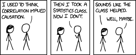
(but sometimes it's a decent exploratory step)
Lab 2 Review!
- Plots for numeric variables and how to interpret them:
boxplot, hist, violin, joint, pair/scatter, heatmap - Attributes and Functions for data exploration:
`.corr()`, `.concat()`, `.index`, `.reindex()`, `.select_dtypes()`, `.drop()` - Dealing with categorical variables via `.astype('category')` on Series objects - more on this later!
Overview 🗺️
(Business) Problem ↔ Data Acquisition ↔ Data Cleaning ↔ Data Exploration / Visualisation ↔ Modelling ↔ Reporting ↔ Deployment- Purpose: familiarise yourself with the data, know which features might be relevant, prepare data for modeling
- Data cleaning (while exploring & visualising): dealing with NaN, checking for nonsensical outliers, cleaning up strings, finding relevant subsets of data (meet conditions you are interested in)
2 key learning points in Lab 3
- Plots for categorical variables and how to interpret them: catplot
(strip/swarm; (enhanced) boxplot, violin; point, bar, count) - Data exploration & cleaning functions:
Views: `.sample()`, `.sort_values()`, `.size()`, `.value_counts()`
More views: `.groupby()`, `.unstack()`,`.set_index()`, `.reset_index()`
Dup: `.unique()`, `.duplicated()`
NaN: `.dropna()`, `.isnull()`, `.fill_na()`
Clean: `.rename()`, `.apply(lambda)`, `re.sub()`,
`.copy()`
1. More about dataviz
Shneiderman's mantra:
Overview first, Zoom and filter, Details on demand
Interactive dashboards: useful for exploration (not for reporting!):
- Facets (from Google developers)
- Build your own with Dash (and Plotly) or Streamlit
- Know the caveats: lots of interpretation, lots of untold stories
More plots
- Parallel plots / Alluvial diagrams: Useful for high dimensional data
- Brushable pairplot and Chord diagrams via d3.js
2. More about data cleaning
Replacing NaN / Outliers
- If too much missing in a row/column, remove it
- Missing randomly: mean of the other rows
- Missing systemically: mean of the relevant subgroup
- Use a model to predict the missing values, based on the other cols
Takeaways
- Plan data structures properly especially for large projects
- Write to CSV files, save your intermediate outputs
- Best to do it in code - reproducible + easy recall. Why not Excel?
- If you have data from multiple sources, it's easier to standardize data formats than to code for each scenario
- Look for automatic EDA libraries, or just customise your own set of code while revising for the quiz
Lab 3 Deliverables
None! Just make sure you go through the materials. :)
Remember that Lab 4 is graded!
(and due 24 hours after the end of the Lab)
Discussion Questions 🤩
Go to www.slido.com and use the event code #Y996, or click here!Extra materials are in the discussion points below:
Credits to Charlene for the slides
(and the pointers on dealing with NaNs)!
One more thing!
- Do well in Year 1, opens up a lot of opportunities
(good internship, URECA, ABP, double major) - Work hard and smart - competing with non-CS/CE ppl too ; at some point the market will saturate
- Have realistic goals in Uni - don't do too much, health comes first
- 1 big goal if possible - break it down, e.g. take external relevant courses/certs, win competitions, do well in intern
- Don’t forget to have fun - best if what you do when having fun is linked to the goal ; fun to talk about / share during interviews
References
This set of slides is made using reveal.js. It's really easy to make a basic set of slides (just HTML) and you can consider using it for simple (tech) presentations! For more advanced customization, you do need CSS and JS but scripts can be easily googled for and it has good documentation.There are also more alternatives here.
CX1115 Telegram Channel!
Some of the TAs have created this initiative to share with y'all interesting stuff (🤩) about DS/AI, join us here! :)
- NOT the official announcement outlet for the course.
Those will still be sent through NTUlearn. - Non-lecture related stuff (e.g. competition, events, interesting articles, datasets, SOTA results linked to what you've learnt)
- Fill up the poll to indicate your preferences on what should be shared
(when it's released, end of the week)